-
Interior Designers: Studio O+A
- Area: 110000 ft²
- Year: 2013
-
Photographs:Jasper Sanidad
-
Manufacturers: Creative Systems Lighting, Hive Modern, Niche Modern
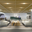
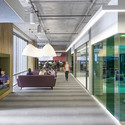
The panoramic view of San Francisco’s water front from Cisco-‐Meraki’s new offices in some ways setsthe theme for O+A’s design. Viewed from almost any angle, the interiors create an impression of light, spaciousness, bright color, long sightlines. Meraki, which was recently acquired by Cisco Systems, takes pride in the elegance of the wireless routers itdesigns. O+A sought to build the space the way Meraki builds its products, with an emphasis on simplicity and seamless ease of use, while remaining mindful of the importance of the Cisco-‐Meraki merger to the company’s identity. Located in the rapidly changing Mission Bay neighborhood, Cisco-‐Meraki’s 110,000-‐square-‐footsuite of offices now becomes Cisco’s principal San Francisco location.
At the outset, O+A surveyed Meraki’s employees to find out what they liked about their old, much smaller headquarters. A consensus emerged for natural light, plenty of collaboration space, and preservation of thecompany’stightly knit culture. The size of the new space and the prominence of its floor-‐to-‐ceiling windows made collaboration and natural light relatively easy to incorporate. O+A’sdesign offers a variety of meeting spaces—formal and informal, indoor and outdoor—many of them bathed in the crystal line light of San Francisco Bay. The scale and the light support a rich palette of colors and design elements: a wide staircase with integrated stadium seating at its base, a meeting room with hanging tillandsia plants, and an outdoor deck offering views of the baseball park and Bay Bridge.
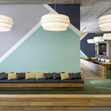
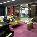
Main taining Meraki’s cozy ambience in the hangar-‐sized complex proved more challenging. O+A’ssolution was to create a medley of small gathering spaces within the large footprint. Sunken seatingbrings intimacy to horizontal common areas while preserving broad sightlines. Yurts, cabanas, and phone rooms offer varying levels of enclosure. Throughout the office, colleagues can sit down and talk in informal lounge spaces.
Despite the rich finishes and the wide array of typologies, one of O+A’s goals was to give Cisco-‐Meraki employees a blank canvas on which to paint their own pictures. In lieu of pervasive branding graphics, O+A provided ubiquitous chalkboards, whiteboards, and corkboards so that employees could sketch, write, and pin-‐up graphics meaning ful to them. As might be expected, given the company’s strong do-‐it-‐yourself culture, mobility and adaptability were big factors in the selection of furniture and work stations. These are people who like to move things around.
The intention was to tame the big space and make it human. Watching Meraki employees travel from department to department via unicycle, gather for lunch on the breezy deck, or make use of the yurtsand wall “pop-‐ins” throughout the day, we believe that goal was achieved.